
DES200
Task 1: Research
SK-II Collaboration with Andy Warhol Foundation.


Drawing on Warhol’s fascination with the relationship between art and mass media the collaboration creates a unique packaging design for the beauty brand that has transformed simplistic, elegant, boring packaging into something bold, fun, and colourful allowing its attractiveness to public buys to be elevated increasing its popularity in the beauty competitive market. Not only is Andy Warhol’s pop art style bringing a fun aspect to the packaging and the way the product looks it is also bringing a sense of fun to the product it is associated with. Also, by taking inspiration from an array of pop culture references, the collaboration releases can be particularly successful at helping the brand reach a young audience. Andy Warhol is well known for his iconic and immediately recognisable pop art piece and this collaboration although still displays his pop art style wanted to share a different side of him, the overall final design not only tapped into Warhol’s Artistic pursuit but also his love for broadcast media, creating VHS-shaped gift boxes and technicolour TV test patterns.
I’m personally entranced by the style of the packaging its out there and quirky and is simply Andy Warhol, adding the Andy Warhol taglines to the packaging in addition to the theme brings the beauty product altogether as a single unit. ‘Broadcast your beauty’ and ‘if everyone isn’t beautiful, then no one is’, not only do they have a positive impact in relations to the products overall style and look it also has a positive impact on the customers as they spread empowering positive messages to all contradicting social beliefs of beauty.
I have always been fascinated by Warhol’s work and to see his style been re-invested into the modern world is wonderful. I myself as an artist have considered the idea of having a career path in which involves either product design or advertisement and to see other artist collaborate with existing brands gives me not only motivation to continue to investigate that career path, but it also inspires me to do so.
Task 2: Sharing a skill


Task 3: Try a skill


For this task I chose to try out Hannah's skill sharing technique. In which she used multiple objects to transfer paint to a surface. I found this technique interesting and I am more than likely to reuse this skill in my future practice as I was intrigued by the outcomes of the skill. Although I was limited to objects in which I could use when trying out this skill I found that the once I did used where successful. I was highly impressed by the markings they left behind that involving both shape and pattern along with depth and texture.
Task 4: Our Homes are a Museum


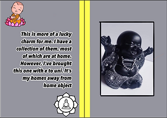


This task was a collaboration task in which me Jess and Stacey captured images from our home and displayed them in a zine. I feel our group worked well together as we all had similar styles and approaches which where all introduced and involved in the making of this zine. As it was our first collaboration together I feel it couldn't have turned out any better, we all had our say on the way we wanted it to look and we all contributed to that, we sat around a tablet whilst Stacey put the pages together, instructing her on what the layout should look like along with the overall colours and images that where to be added to each page. To create the zine we used Stacey's iPad and ibis Paint app. For the overall concept we decided to go for yellow and pink on the front cover and back cover and then keep a yellow bind on each page to keep a running theme of the yellow throughout this was our starting point. Then we went on to discuses the inside pages and the images we where to display in which order. We agreed on a double page spread in which we have our photos on one side and then the text on the opposite side to give a little information on why we chose these images, to decide the colours each of the pages, we would pick out two colours, a darker and lighter colour from the images we captured and use those colours for the text and background once happy with the layout of the double page spread, we then added in little sketches of images we thought linked with our items to keep our zine a bit more busy and give it more to look at.
Task 5: Issue Zero

Horrors of Life- is a zine that capture peoples phobias, and brings more information on what they are and how people live with them on a daily basis throughout their lives.
Task 6: Publication Task
Proposal:
Title ideas:
-What it was What it is What it will be Then Now Future
- What's Next? Our Timeline
Our publication is a collection of different items/places that shows the evolution of human creations and how we think humanity will develop their creations to cater to the future. We will have 3 images on each page- a past image, current image and an idea of future images we will create. Using a range of different mediums throughout from our own individual practise to represent the future image. Simplistic layout 3 images per page in order of past, now, future. We want to use a mix of mediums to allow ourselves creative freedom to design our future items/places.
We want to make this publication digitally, as we believe that this will be the easiest way for us to all lay it out in a simple but elegant way. Due to this, we would want to scan any pieces that we make that are not digitally made for ease. We want to avoid the use of too many colours within the publication so that nothing takes away from the images themselves. due to this we have decided on a white background and where the spine ant the joint of the book is, we want to have a block of colour matching something on the page, whether that be the text or a colour that continues throughout all the images and then a thin border around the rest of the page of the same colour. We want to do this so that there is an element that connects all the pages. We also want do acheive this my the way we want to place out the images on each page in the same way.


Final product:

When designing this publication we all took on different roles. Stacey and I came up with how the basic layout would look and what we were going to use to attach all the pages. We also came up with the measurements that we felt would be best to allow enough space on each page to show the images on each page. After this, we all came up with two things in which we wanted to show and created/collected three separate images for the chosen object, one from when the object was first create( that being the past image), one from now (that being the present image) and one in which we came up with from our imagination ( that being the futuristic image in how we see the object to be in the future). Once we all had the pieces made/gathered, we sent them to Jess, along with a description of what they are i.e. when then where first introduced to the world, to give a little bit of context to our images. After this, Jess then turned our digital mock up of the publication in to the physical publication.
INSIDE PAGES:


