Due to my theme chosen theme being Propaganda one of the first factors I considered within the production of a piece is the text, that being the font used, the size and the colour. Therefore, one of the first things I did was test different styles of text to see which one was more beneficial to my theme, the most successful font being named 'Impact'. After find a suitable text style I then turned my attention to finding a subject matter that I could produce propaganda poster about. My first creations/drawings were based around and inspired by J. Howard. Miller's propaganda piece 'we can do it'. The main focuses point being a women with a bicep curl showing power and strength. I did drawings that to me were basic factors of propaganda poster and tried to relate them to current world subjects hence the 'smoking kills' drawing, it was a starting point that allowed me to develop the drawings in to canvas painting to experiment with different mediums and colours to bring about pieces in the propaganda style.
Canvas paintings.


After creating my canvas pieces I then went on to digitally produce samples for my propaganda posters along with actually assembling final posters. all the while adding extra drawings and paintings to the project along with settling on a collective topic to focus my posters on. For some of my digital piece I had to collect primary images of my female peers in order to create propaganda piece, of which I have came to recognizes are highly inspired by that of the work of Shepard Fairy as can be seen in the pieces themselves.
Photography.


Edited Photography.


The majority of the piece above are highly inspired by that of the work of Shepard Fairy, using the same propaganda style and single word to capture the attention of the viewing audience. When creating these pieces, for each person that I had taken an image of I asked them to provide me with a single word, just one, that best describes them as a person. Although an image can say a thousand words pair that with one selective word can allow the over all final out come to be more effective and powerful than just an image on its own. Each word given to each person is unique and dedicated to who they are allowing their individual personas to be displayed. Due to all my piece portray women it has allowed me to develop my work to surround the topic that is feminism, mostly to look upon how women are portrayed in society and the current challenges we face in the everyday world, as a young women I can display my personal views on feminism and what it is like for me to survive in what is portrayed as a mans world. .
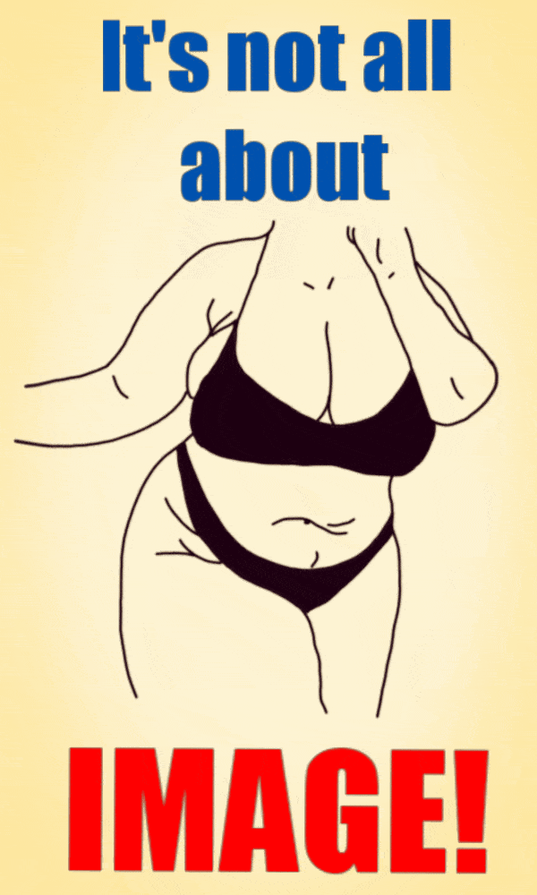
Digital artwork surrounding the topic that is Body image.


After discovering I wanted to base my propaganda art around feminism I looked into what I believe are sensitive and problematic subjects that are highly important to women and how they are shaped. The first being Body image and how we are presented in society. The world has a distinctive perspective that is very stereotypical to the way a women should look in order to be classed as 'normal' and accepted by others. The second subject being Periods and the period poverty that is a critical problem in the modern world. Periods are natural and women shouldn't be limited or shamed by them.
My digital drawings above display different body types to show the variety of women in the world do exists and not all two body's are the same, we all have flaws and insecurities and should appreciate them and not be shamed for doing so. From those digital drawings I have also created paintings and pencil drawings that can be seen further above, in different forms that capture my propaganda style.
"Different women experience different levels of expectation from society to perform femininity."-WOMEN DON'T OWE YOU PRETTY- Florence Given. The world around us has shaped women to look a certain way and judges them on the 'scale of desirability'. It would be wonderful if women didn't feel the need to go to extreme measures just to posture their bodies in a 'desirable enough' light. Up until now we have been bombarded with the same ideas and stories that either make us subconsciously hate ourselves and our bodies along with other people. Hopefully the idea and concept be hind my body image work can shed light to women that you should feel comfortable in your body, not all two bodies are the same, everyone is of a different shape and size, and different is allowed. Different is beautiful. "You are the love of your own life."-WOMEN DON'T OWE YOU PRETTY-Florence Given. In addition to the digital drawings, pencil drawings and paintings, I did a collaborative piece with Racheal which focus upon body images and the nasty ways in which it shapes culture and every day women. The piece shows of both our unique styles capture the horrid truth behind how women are negatively portrayed.


This collaborative piece incorporates both mine and Racheal's chosen themes. I started with canvas first and created a piece that displays a female body in a propaganda style, with the slogan "Our body our chose", using both primary colours red and blue to allow the bold black drawing to pop and standout. After finishing the propaganda piece I passed the canvas on to Racheal so she could added the finer details to the foreground which replicates the idea of bruised skin in paint and also displays text in which are negative words/name spoken towards women like ourselves. In a male dominated world women are objectified, they are used and tarnished based upon their appearances and statutes, they are abused both physical, emotional and verbal to dehumanise them. Many women chance who they are and lose themselves to fit the perspectives of others and society when in reality it is the perspectives of society that should change and women should be made to feel strong, beautiful, normal and powerful rather than weak and disgusting.
Collaborative piece.

Artwork surrounding the topic that is period poverty.


Posters where created digitally then displayed in poster bomb like fashion to imitate that of the Airborne leaflets dropped in past historical events i.e. World War 1 and World war 2. The posters clearly demonstrates the application of political/commercial advertising techniques that is appealing to public. Incorporating a propaganda style with my own modern twist to be attractive and assertive to the viewing audience in order to encourage and gain support for the need to end period poverty for the female population of the world who suffer and are damaged by the portrayed issue. Have in the poster bomb layout gives a fresh style and layout to the way poster can be displayed rather than just placing them on a wall, having the distributed across the floor and allowing people to walk amongst them makes it more memorable.
Bigger poster bomb installation.


GIFS